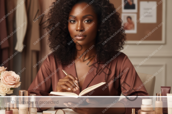
Decoding Brand Shade Systems for Deep Skin
You’ve been there: standing in front of a dazzling display of foundations, armed with a brand’s shade chart, feeling confident you’re about to find your perfect match. The numbers, letters, and descriptive names all seem so logical, so precise. You pick what appears to be the right one, perhaps even consult a sales associate, and head home with a hopeful heart. But then, under your own lighting, the magic fades. The shade is too red, too ashy, too light, or too dark. It’s a familiar, frustrating dance that many Black women and those with deep, melanin-rich skin tones know all too well.
This experience isn’t a reflection of your inability to choose or your confusion. It’s often a symptom of how beauty brands design and present their shade systems, especially when it comes to the deeper end of the spectrum. What one brand calls “warm,” another might consider “neutral.” A shade labeled “deep” in one line could be a medium-dark in another. The language, the numbers, the very structure of these systems can be inconsistent, misleading, and frankly, unhelpful, particularly when brands compress their deep ranges or misinterpret undertones inherent in melanin-rich skin.
At Black Beauty Basics, we believe that understanding these nuances is a powerful skill. It’s about equipping yourself with the knowledge to look beyond the marketing jargon and read between the lines of a brand’s shade system. This guide isn’t about blaming brands, but about empowering you to navigate their offerings with a critical eye, saving you time, money, and the disappointment of yet another mismatched foundation. Consider this your masterclass in deciphering the secret language of foundation shades, transforming you from a hopeful buyer into a discerning expert.
What This Post Covers
This comprehensive guide is designed to demystify the often-confusing world of foundation shade systems, specifically tailored for the unique needs of deep, melanin-rich skin tones. We’ll delve into the common pitfalls and inconsistencies that make finding your perfect match a challenge, and more importantly, equip you with the strategies to overcome them. Here’s what you can expect to learn:
- The Inherent Challenges: We’ll explore why brand shade systems frequently fall short for deep skin tones, from compressed ranges to inconsistent undertone labeling.
- Decoding the Language: Learn to interpret numbers, letters, and descriptive names (like “warm,” “cool,” “neutral,” “golden,” “red,” “olive”) that brands use, understanding their potential meanings and how they might vary.
- Navigating Shade Ladders: Discover how to critically assess a brand’s shade ladder, identifying gaps, jumps, and potential misrepresentations within the deeper end of the spectrum.
- The Undertone Conundrum: Understand why the same undertone name can behave differently across various brands and how to verify what a brand actually means by its undertone descriptors.
- Beyond Foundation: We’ll discuss how these decoding skills apply not just to foundation, but also to concealers, powders, and other complexion products.
- Strategic Shopping: Practical advice on how to use brand systems as clues rather than commands, empowering you to make informed decisions and avoid costly mistakes.
By the end of this article, you’ll possess a more sophisticated understanding of how to approach shade selection, transforming a once daunting task into a strategic and successful endeavor. Our goal is to empower you to find complexion products that truly celebrate and enhance your beautiful, melanin-rich skin.
Why Brand Shade Systems Break Down on Deep Skin
The quest for the perfect foundation match is often more arduous for Black women and those with deep skin tones, and a significant part of this struggle stems from the inherent flaws and biases within brand shade systems themselves. These systems, while appearing logical and comprehensive on the surface, frequently break down when applied to the rich diversity of melanin-rich complexions. It’s not a failure on your part to understand them; it’s often a failure of the systems to adequately represent you.
Compressed Deep Ranges: The Illusion of Inclusivity
One of the most pervasive issues is the phenomenon of “compressed deep ranges.” Many brands, even those lauded for their “inclusive” shade offerings, tend to dedicate a disproportionately small number of shades to the deeper end of the spectrum. While they might boast 40, 50, or even 60 shades, a close examination often reveals a vast majority of these shades catering to lighter and medium skin tones, with only a handful designated for deep complexions. This compression means that the subtle, yet crucial, variations in depth and undertone that exist within deep skin tones are often ignored or lumped together. A brand might offer three “deep” shades, expecting them to cover the same breadth of diversity that is afforded to twenty “light” or “medium” shades. This approach inevitably leads to poor matches, as individuals are forced to choose between shades that are either too light, too dark, or simply the wrong undertone for their specific complexion.
Inconsistent Undertone Labeling: A Semantic Minefield
Undertones are the subtle hues beneath the surface of your skin, and for deep skin, they can range from red, golden, olive, peach, and even true neutral. Brands attempt to categorize these with labels like “warm,” “cool,” “neutral,” “golden,” “red,” “olive,” or even more specific descriptors. However, the interpretation and application of these labels are far from standardized across the industry. What one brand considers a “warm” undertone might be a distinctly “golden” shade, while another’s “warm” could lean heavily red. A “neutral” from one line might appear almost cool on deep skin, while another’s “neutral” could have a subtle golden cast. This inconsistency is a semantic minefield, making it incredibly difficult to translate your known undertone from one brand to another. It forces you to re-evaluate and re-learn a brand’s specific undertone language with each new product, adding layers of complexity to an already challenging process.
Shade Naming Conventions: More Marketing Than Meaning
Beyond numbers and letters, brands often employ descriptive names for their shades – “Caramel,” “Espresso,” “Mahogany,” “Cacao,” “Rich Amber,” “Deep Bronze.” While these names can sound appealing and evocative, they are frequently more about branding and marketing than providing accurate, universal descriptors of a shade’s depth or undertone. “Caramel” in one line might be a medium-deep golden, while in another, it could be a deep neutral. “Espresso” could be a true deep brown or a deep red-brown. These names lack standardization and can be highly subjective, making it nearly impossible to predict a shade’s appearance based on its name alone. They can create a false sense of familiarity or expectation that often leads to disappointment when the actual product doesn’t match the mental image conjured by the name.
Lack of True Neutrality and Overemphasis on Red Undertones
Another common breakdown occurs with the representation of neutral undertones and the often-misguided emphasis on red undertones for deep skin. Many brands struggle to formulate truly neutral shades for deeper complexions, often defaulting to either overly golden or overly red undertones. For those with a genuinely neutral undertone, this leaves a significant gap. Furthermore, there’s a historical tendency to assume that all deep skin tones have strong red undertones, leading to foundations that can appear overly ruddy or brick-like on many Black women who actually possess golden, olive, or even cooler undertones. This oversimplification ignores the vast spectrum of undertones within deep skin, leading to a proliferation of shades that are simply not suitable for a large segment of the audience they claim to serve.
The Disconnect Between Visuals and Reality
Finally, the visual presentation of shade systems – whether on a website, a printed chart, or even in-store swatches – can be misleading. A clean, aesthetically pleasing shade chart might give the impression of a smooth, gradual progression of shades and undertones. However, upon closer inspection or actual application, significant jumps in depth or abrupt shifts in undertone can become apparent, especially within the deeper range. The digital representation of shades can also be highly inaccurate due to screen calibration, lighting, and photography variations. This disconnect between the idealized visual system and the real-world performance of the shades is a major reason why brand shade systems frequently fail to deliver accurate matches for deep skin tones, fostering frustration and a cycle of trial and error for consumers.
How to Read Numbers, Letters, Names, and Undertone Tags
Navigating the labyrinth of foundation shades requires a strategic approach to deciphering the various cues brands provide. Numbers, letters, names, and undertone tags are meant to guide you, but for deep skin tones, they often require a more critical interpretation. Understanding what these elements might mean, and more importantly, what to verify, is key to making informed choices.
Numbers: Depth Indicators with Variable Scales
Numbers are typically used to denote the depth or lightness/darkness of a shade. Generally, lower numbers indicate lighter shades, and higher numbers indicate deeper shades. However, this is where the consistency ends. The scale itself varies wildly between brands:
- Linear Scales: Some brands use a simple linear scale, like 1 to 100, where each increment represents a small step in depth. This is often the most intuitive.
- Segmented Scales: Other brands might segment their numbers, with 1-10 for light, 11-20 for medium, 21-30 for deep, and so on.
- Non-Linear Jumps: Crucially for deep skin, some brands might have very small numerical jumps in their lighter ranges (e.g., 10, 11, 12, 13) but then make huge leaps in their deeper ranges (e.g., 50, 60, 70), indicating significant gaps in depth.
- Arbitrary Numbers: Some numbers seem almost arbitrary, without a clear progression, or are combined with letters in a way that makes the numerical component less about depth and more about a unique shade ID.
What to Verify: Always look at the entire shade range, especially the deepest shades. Do the numbers progress smoothly, or are there large gaps? Compare the numerical difference between adjacent deep shades to those in the lighter ranges. A jump from 80 to 90 might represent a much larger color shift than a jump from 20 to 21 in the same line.
Letters: Undertone Cues and Positional Markers
Letters are most commonly used to denote undertone, but they can also serve as positional markers within a shade family. Common undertone letters include:
- C: Cool (often indicating pink, red, or blue undertones)
- W: Warm (often indicating yellow, golden, or peach undertones)
- N: Neutral (a balance of warm and cool, or sometimes a slight golden/beige)
- R: Red (specific red undertones, often seen in deeper shades)
- G: Golden (specific golden/yellow undertones)
- O: Olive (a mix of yellow and green undertones)
However, the interpretation of these letters is highly brand-dependent. A “W” for one brand might be a subtle golden, while for another, it could be a very strong yellow. A “C” in a deep shade might be a true red, while in a lighter shade, it might be a cool pink. Some brands also use letters to denote variations within a specific depth, for example, “40G” and “40R” might be the same depth but with different undertones.
What to Verify: Do not assume a letter means the same thing across brands. Look for swatches of shades with different letters at the same depth. Does the “N” truly look neutral, or does it lean warm or cool? How strong are the “W” or “C” undertones? For deep skin, be particularly wary of “C” shades that might be too ashy or “W” shades that are too orange/yellow without sufficient depth.
Descriptive Names: Evocative but Often Vague
Shade names like “Caramel,” “Mahogany,” “Espresso,” “Cacao,” “Rich Bronze,” “Deep Amber,” “Truffle,” or “Mocha” are designed to be appealing and give a general sense of the shade. They are often more about creating a brand identity than providing precise color information. While they can help you narrow down a general depth, they are notoriously inconsistent in indicating undertone or exact depth across different brands.
- “Caramel” could be a medium-deep golden or a deep peach.
- “Mahogany” might be a deep red-brown or a deep neutral brown.
- “Espresso” could be a very deep cool brown or a deep warm brown.
What to Verify: Use names as a very loose starting point. Never rely on a name alone to determine your match. Always cross-reference with swatches, numbers, and undertone tags. If a brand only uses names without any numerical or letter system, be extra cautious and rely heavily on visual swatches and reviews from individuals with similar skin tones.
Undertone Tags: The Most Misunderstood Element
Undertone tags are explicit labels like “Warm,” “Cool,” “Neutral,” “Golden,” “Red,” “Olive,” “Peach,” “Rich,” “Deep,” etc. These are meant to directly tell you the undertone. However, as discussed, their interpretation is highly subjective and inconsistent:
- “Warm” vs. “Golden” vs. “Red”: Some brands use “Warm” as a catch-all for anything with yellow, golden, or red tones. Others differentiate, offering distinct “Golden” and “Red” undertones. For deep skin, “Warm” can often translate to a strong orange or red cast if not formulated correctly.
- “Cool”: For deep skin, “Cool” can be particularly tricky. It might mean a true blue-red undertone, a subtle plum, or, unfortunately, an ashy gray cast if not balanced with enough depth.
- “Neutral”: A true neutral for deep skin is a beautiful balance, but many “neutrals” lean slightly warm (golden-beige) or slightly cool (rosy-beige).
- “Olive”: A rare but crucial undertone for many Black women, “Olive” often gets overlooked or is poorly represented. When present, it signifies a mix of yellow and green, which can be hard to spot in brand swatches.
What to Verify: This is where critical observation comes in. Look at the actual swatches. Does the “Warm” shade look truly golden on deep skin, or does it look orange? Does the “Cool” shade look vibrant and rich, or dull and ashy? Compare the “Neutral” shade to both the “Warm” and “Cool” options at the same depth to see where it truly sits. Pay close attention to how these undertones interact with the depth of the shade – a “warm” undertone in a very deep shade will look different than in a medium shade.
The Brand’s Internal Logic: A Table of Cues
To summarize, here’s a simple table to help you approach brand cues with a critical mindset:
| Brand Cue | What it May Mean (General) | What to Verify (Critical for Deep Skin) |
|---|---|---|
| Numbers (e.g., 10, 50, 100) | Depth (lower = lighter, higher = deeper) | Are there significant numerical jumps in the deep range? Do these jumps correspond to large color shifts? Is the scale linear or segmented? |
| Letters (e.g., C, W, N, R, G, O) | Undertone (Cool, Warm, Neutral, Red, Golden, Olive) | Does the letter’s meaning align with your understanding of that undertone? How strong is the undertone? Does ‘C’ look ashy or truly cool? Does ‘W’ look orange or truly golden? |
| Descriptive Names (e.g., Caramel, Espresso) | General depth and sometimes a hint of undertone | Is the name consistent with the visual swatch? Is it more marketing than actual color information? Never rely on names alone. |
| Undertone Tags (e.g., Warm, Cool, Neutral, Golden) | Explicit statement of undertone | Does the actual shade reflect the stated undertone? Compare to other undertones at the same depth. Does “Neutral” lean warm or cool? Is “Red” too ruddy or just right? |
| Shade Ladder/Chart | Visual representation of the full range | Are there noticeable gaps in depth or undertone, especially in the deep end? Do the swatches look like they progress smoothly or are there abrupt jumps? |
By adopting this critical lens, you transform from a passive recipient of brand information into an active decoder, better equipped to identify shades that truly complement your unique complexion.
What to Check When Brands Compress Their Deeper Range
The compression of deeper shade ranges is a pervasive and frustrating issue that disproportionately affects Black women and individuals with melanin-rich skin. While a brand might proudly announce a large number of shades, a closer look often reveals a glaring imbalance: a multitude of options for lighter skin tones, and a mere handful for deeper complexions. This isn’t just an inconvenience; it’s a significant barrier to finding an accurate match. When brands compress their deeper range, they essentially force a vast spectrum of unique skin tones into a few ill-fitting categories. Knowing what to check for can help you identify these limitations and navigate them more effectively.
Identifying Gaps in Depth: The “Stair-Step” Effect
A well-formulated shade range should exhibit a smooth, gradual progression in depth from the lightest to the deepest shades. Imagine a gentle slope. When a brand compresses its deeper range, this slope often turns into a “stair-step” effect. You might see many small, incremental steps between lighter shades, but then suddenly, a huge jump in depth between two adjacent deep shades. This jump indicates a significant gap where many potential matches are simply missing.

- Look for Visual Jumps: On a shade chart or display, visually scan the progression. Are the transitions between deep shades as subtle as those between lighter shades? If one deep shade looks significantly darker than the one before it, without a natural in-between, that’s a red flag.
- Analyze Numerical Spacing: If the brand uses numbers, compare the numerical difference between adjacent deep shades to those in the lighter or medium ranges. For example, if shades 10-20 are spaced by 1 unit (10, 11, 12), but deep shades go from 80 to 90 to 100, those 10-unit jumps are likely masking huge gaps in actual color depth.
- Consider the Undertone Shift with Depth: Sometimes, a brand will try to compensate for depth compression by shifting undertones dramatically between deep shades. For instance, a shade might be deep and golden, and the next deepest shade is suddenly very deep and very red, with no deep neutral or deep olive in between. This isn’t a true progression but a forced choice.
Your Strategy: If you identify a significant gap, understand that you might fall squarely within that missing range. This means you’ll either have to settle for a shade that’s slightly too light or too dark, or consider mixing two shades (if available and practical) to create your custom depth. This is a common reality when dealing with compressed ranges.
Assessing Undertone Representation Within the Deep Range
Beyond just depth, compressed ranges often suffer from a severe lack of undertone diversity within the deeper shades. Brands might offer a wide array of cool, warm, and neutral undertones for lighter skin, but then only provide one or two undertone options (often warm/red or neutral/ashy) for their deepest shades. This is particularly problematic for individuals with less common undertones like true olive, peach, or nuanced golden tones in deep skin.
- Count Undertone Options: For the deepest 5-10 shades, how many distinct undertones are offered? If it’s only “warm” and “neutral,” and you know you have a strong red or olive undertone, the brand likely won’t have a match for you.
- Examine Undertone Consistency: Do the undertones remain true to their labels across different depths? Sometimes, a “neutral” in a medium shade becomes distinctly warm or cool in a deep shade, indicating a lack of careful formulation across the spectrum.
- Look for “Default” Undertones: Many brands default to a strong red or a muddy neutral for deep skin. If all the deep shades seem to have a similar underlying hue, despite different labels, it’s a sign of limited undertone consideration.
Your Strategy: If undertone options are limited, you may need to accept a shade that is close in depth but requires a color corrector or mixer to adjust the undertone. This is a skill worth developing to make “almost right” shades work for you.
The “Deep” vs. “Rich” vs. “Dark” Language: Decoding Brand Intent
Brands use various terms to describe their deeper shades, and these terms can sometimes offer clues about their approach to inclusivity. While not a definitive rule, paying attention to this language can be insightful:
- “Deep”: A common and neutral term. It doesn’t necessarily indicate a robust range, but it’s standard.
- “Rich”: Often used to evoke warmth, vibrancy, and luxury. When paired with deep shades, it *can* sometimes indicate a more thoughtful approach to undertones, aiming for shades that are not muddy or ashy. However, it can also just be marketing fluff.
- “Dark”: Sometimes used, but can carry negative connotations and might signal a less nuanced approach to formulating for deeper skin.
- Descriptive Names: As discussed, names like “Espresso,” “Cacao,” “Truffle” can be appealing, but they don’t inherently guarantee a comprehensive range.
Your Strategy: Don’t let the language alone sway you. Always cross-reference with visual evidence. A brand using “Rich Mahogany” might still have only two deep shades. A brand using “Deep 100” might have a surprisingly nuanced range. The language is a hint, not a guarantee.
The Visual Proof: Model Swatches and In-Store Displays
Ultimately, the most telling evidence of a compressed deep range comes from visual inspection. This includes how shades are displayed online and in-store.
- Online Swatches: Look at swatches on multiple models with diverse deep skin tones. Do you see significant jumps between the deepest shades? Are the models’ undertones varied, or do they all seem to fit a narrow mold?
- In-Store Displays: If possible, view the physical products. Are the deepest shades clearly distinct, or do several look almost identical in the bottle/pan, only to reveal subtle undertone differences when swatched? Are there large gaps between the physical testers?
- Look at the “End” of the Range: Some brands will have a few very deep shades, but they might all be extremely warm/red or extremely cool/ashy, indicating a lack of true neutral or diverse undertones at the deepest end.
Your Strategy: Be a detective. Compare, contrast, and critically evaluate what you see. Don’t be afraid to walk away if a brand’s deepest range clearly doesn’t cater to your specific depth and undertone. Your time and money are too valuable to settle for a poor match due to a brand’s limited offerings.
How to Use Brand Systems as Clues Instead of Commands
The core philosophy of navigating brand shade systems for deep skin is to shift your perspective: view them as clues, not commands. A brand’s numbering, lettering, and naming conventions are designed to provide a framework, but for melanin-rich skin, this framework is often incomplete, inconsistent, or even misleading. Treating these systems as rigid instructions can lead to repeated frustration and wasted purchases. Instead, adopt the mindset of a detective, gathering evidence and cross-referencing information to make an informed decision.
The Initial Scan: Gathering the First Clues
When you first encounter a new brand’s shade system, whether online or in-store, start with a broad scan. Don’t immediately jump to what you think is “your” shade. Instead, try to understand the brand’s overall approach:
- Observe the Full Range: How many shades are there? How many appear to be in the deep category? This gives you an immediate sense of the brand’s commitment to inclusivity.
- Identify the System Type: Does the brand primarily use numbers, letters, or descriptive names? Is it a combination? Understanding the primary organizational method will help you focus your decoding efforts.
- Look for Obvious Gaps: Even at this initial stage, you might spot large jumps between shades in the deeper range, indicating compression.
These initial observations are your first set of clues, informing how much trust you can place in the system’s precision.
Deconstructing Undertones: Your Most Important Clue
For deep skin, undertone is often the most critical and most misunderstood element. Brands’ undertone labels are perhaps the biggest area where “clue” trumps “command.”
- Don’t Assume Consistency: Never assume a “Warm” from Brand A is the same as a “Warm” from Brand B. Each brand has its own internal logic for what these terms mean.
- Compare Adjacent Undertones: If a brand offers “Warm,” “Cool,” and “Neutral” at a similar depth, compare them side-by-side. Does the “Neutral” truly look balanced, or does it lean one way? Does the “Cool” look ashy or vibrant? Does the “Warm” look orange or genuinely golden/red? This comparison reveals the brand’s specific interpretation.
- Pay Attention to Subtlety vs. Intensity: Some brands have very subtle undertones, while others are intensely saturated. Your skin might prefer a subtle undertone, even if your natural undertone is strong.
- Look for Specific Undertone Descriptors: If a brand uses “Golden,” “Red,” “Olive,” or “Peach” instead of just “Warm/Cool/Neutral,” these are stronger clues, but still require verification.
Actionable Step: If possible, swatch shades with different undertone labels next to each other on your jawline or chest. This is the only way to truly see how the brand’s undertone interpretation interacts with your skin.
Shade Ladders: A Visual Narrative, Not a Perfect Map
The visual shade ladder or chart is a powerful clue, but it’s rarely a perfect map. It tells a story, and your job is to read between the lines.
- Examine the Progression: Does the depth increase smoothly, or are there sudden jumps? For deep skin, these jumps are often where matches are missed.
- Look for Undertone Shifts Within Depths: Sometimes, a brand will offer a good range of undertones in medium shades, but then only one or two options in the deepest shades. This is a clue that their inclusivity might be limited at the extreme ends.
- Compare Model Swatches Critically: If the brand provides swatches on models, look for models with skin tones similar to yours. Do the shades look natural on them? Do they appear to have similar undertones? Be wary if all deep shades are swatched on models with only one type of deep undertone (e.g., all red-toned).
Actionable Step: Mentally (or physically, if you have access to testers) place your ideal shade within the ladder. If it falls squarely between two shades with a significant visual gap, you know you might need to blend or look elsewhere.
Cross-Referencing: The Ultimate Verification
The most effective way to use brand systems as clues is to cross-reference all available information:
- Numbers + Letters + Names + Swatches: Don’t rely on just one cue. If a shade is “80W Caramel,” look at the swatch. Does it look like an 80-level depth? Does it look genuinely warm and caramel-toned? If any of these clues contradict each other, proceed with caution.
- Online Reviews and Swatches from Diverse Sources: Seek out reviews and swatches from other Black women or individuals with deep skin tones. Their real-world experience is an invaluable clue. Look for videos where they apply the product, not just static swatches.
- In-Store Testing (When Possible): Nothing beats testing on your own skin under various lighting conditions. Swatch 2-3 shades you’ve identified as potential matches based on your decoding. Let them dry down, as shades can oxidize and shift.
- Consider the Brand’s Overall Reputation: Some brands are known for their excellent deep shade ranges and thoughtful undertone formulation (e.g., Fenty Beauty, Pat McGrath Labs, NARS). Others, despite recent efforts, may still be catching up. This reputation is another clue.
Actionable Step: Create a mental checklist. Does the number make sense for the depth? Does the letter/tag match the visual undertone? Does the name align with the overall impression? Do real-life swatches confirm your hypothesis? The more “yes” answers you get, the more confident you can be.
Beyond Foundation: Applying Decoding Skills to Concealer and Powder
These decoding skills are not exclusive to foundation. They are equally vital for selecting concealers and powders, which often have even more compressed and less diverse shade ranges than foundations.
- Concealers: For concealers, you might be looking for a shade that’s slightly lighter than your foundation to brighten, or one that matches perfectly to cover. The same rules apply to undertones: a “warm” concealer might be too orange if not carefully selected. Pay attention to how brands translate their foundation shades into concealer shades – sometimes they don’t align perfectly.
- Powders: Powders for deep skin are notoriously difficult. Many can look ashy, dull, or add an unwanted cast. Decoding powder shades requires even more scrutiny of undertones. A “translucent” powder might not be truly translucent on deep skin, and a “neutral” powder might pull too cool or too warm. Look for powders specifically formulated for deep skin, often with golden or red undertones to avoid ashiness.
By treating every brand system as a set of clues to be investigated and verified, you empower yourself to make more accurate choices, reducing the guesswork and increasing your success rate in finding complexion products that truly flatter your melanin-rich skin.
How to Navigate This Topic
Successfully decoding brand shade systems for deep skin is less about memorizing specific brand charts and more about developing a critical, analytical mindset. This section outlines a structured approach to navigating this complex topic, ensuring you gain practical skills that transcend any single brand or product. It’s about empowering you to be your own expert, equipped to make informed decisions and avoid common pitfalls.
Step 1: Understand Your Own Skin (The Foundation)
Before you can effectively decode a brand’s system, you must first understand your own skin. This is the absolute foundation upon which all successful shade matching rests. Without a clear understanding of your own depth and undertone, any brand system will remain a confusing enigma.
- Determine Your Skin Depth: Are you light-deep, medium-deep, or very deep? This is a general categorization, but it helps you narrow down the range of shades to focus on.
- Identify Your Primary Undertone: Are you warm (golden, yellow, peach), cool (red, blue, plum), neutral, or olive? This is the most crucial piece of information. Spend time truly observing your skin in natural light. Look at your jawline, neck, and chest. Do you see hints of gold, red, green, or a balance? If you need a refresher, our article on how to read your undertone on deep, melanin-rich skin is an invaluable resource.
- Recognize Your Overtones (Surface Color): While undertones are consistent, overtones can be influenced by sun exposure, hyperpigmentation, or even redness. Be aware of how your surface color might differ slightly from your underlying undertone.
Actionable Tip: Keep a mental (or physical) note of your skin’s characteristics. For example: “Medium-deep with strong golden-olive undertones, prone to hyperpigmentation.” This personal profile is your ultimate reference point.
Step 2: Research and Pre-Screen Brands (The Initial Filter)
Once you know your own skin, you can begin to pre-screen brands more effectively. Not all brands are created equal when it comes to deep skin, and some are simply not worth your time or money.
- Prioritize Brands Known for Inclusivity: Start with brands that have a reputation for robust and well-formulated deep shade ranges. These often include brands founded by or catering specifically to women of color, or those that have made significant commitments to diversity.
- Consult Reviews and Swatches from Diverse Sources: Before even looking at a brand’s official chart, search for reviews, blog posts, and YouTube videos from other Black women with similar skin tones and undertones. Their real-world experiences are invaluable. Look for swatches on different skin tones and under various lighting conditions.
- Examine the Full Shade Chart Online: Visit the brand’s website and look at the entire shade lineup. Does the deep range look compressed? Are there obvious gaps? How many undertone options are available for the deepest shades?
Actionable Tip: Create a shortlist of 2-3 brands that appear promising based on your research. This saves you from being overwhelmed by too many options.
Step 3: Analyze the Brand’s System (The Decoding Phase)
Now, apply the decoding principles discussed earlier to your shortlisted brands. This is where you treat their system as clues.

- Deconstruct Numbers, Letters, and Names: Understand how the brand uses these elements. Do numbers indicate depth? Do letters consistently denote undertones? Are names purely descriptive or do they offer more specific clues?
- Assess the Shade Ladder for Gaps: Visually inspect the progression of shades, especially in the deeper range. Are there smooth transitions or noticeable jumps?
- Interpret Undertone Labels Critically: Don’t take “Warm” or “Neutral” at face value. Look at the actual swatches (online or in-store) to see what the brand’s interpretation truly looks like. Does their “Warm” align with your golden undertone, or is it too red?
- Compare Adjacent Shades: Mentally (or physically) compare shades that are close in depth but have different undertones, or shades that are close in undertone but different in depth. This helps you understand the brand’s internal logic.
Actionable Tip: If you’re shopping online, use tools like “find your shade” quizzes, but always cross-reference their suggestions with your own analysis of the shade chart and swatches. Take screenshots for comparison.
Step 4: In-Store Verification (The Reality Check)
If possible, an in-store visit for verification is crucial. This is where the clues from online research meet the reality of physical product and real lighting.
- Swatch Multiple Shades: Don’t just swatch one. Based on your decoding, pick 2-3 shades that seem like the closest matches in depth and undertone. Swatch them on your jawline, neck, or chest.
- Observe Under Different Lighting: Step away from the brightly lit makeup counter. Go to natural light near a window, or even step outside. Testing shades in-store and under real-life lighting is paramount for deep skin.
- Allow for Oxidation: Let the swatches dry down for 10-15 minutes. Many foundations, especially on deeper skin, can oxidize and change color.
- Consult a Sales Associate (with Caution): While some associates are highly skilled, others may not be trained for deep skin tones. Use their input as another clue, but trust your own judgment first.
Actionable Tip: Take photos of your swatches in different lighting. This provides a visual record for later comparison and reduces the pressure to make an immediate decision.
Step 5: Make Your Decision (The Informed Choice)
After gathering all your clues and performing your verification, you’re ready to make an informed decision.
- Prioritize Undertone First, Then Depth: An incorrect undertone is often more jarring than a slightly off depth. If you have to compromise, prioritize getting the undertone right.
- Consider Mixers/Correctors: If you find an almost-perfect shade that’s just a touch off in depth or undertone, remember that correctors and mixers can be your allies. This allows you to broaden your acceptable shade range.
- Don’t Be Afraid to Walk Away: If no shade truly works, or if the process feels too forced, it’s okay to walk away. There are many brands out there, and your perfect match exists.
By following these steps, you transform the daunting task of shade matching into a strategic process. You move beyond passively accepting brand labels to actively decoding them, ensuring that the products you choose truly celebrate your unique beauty.
Where to Go Next
Decoding brand shade systems is a crucial step in your journey to finding your perfect complexion products, but it’s just one piece of a larger, empowering puzzle. To truly master your makeup for deep, melanin-rich skin, there are several other essential areas to explore. Black Beauty Basics is designed to be your comprehensive guide, offering insights that build upon each other. Here’s where you can deepen your knowledge and refine your skills:
Mastering Your Undertone
Understanding your own skin’s undertone is the bedrock of successful shade matching. If you’re still unsure about whether you’re warm, cool, neutral, or olive, or if you want to refine your understanding, this is your next essential read:
- How to Read Your Undertone on Deep, Melanin-Rich Skin: This article provides detailed methods and visual cues to help you accurately identify your unique undertone, which will empower you to interpret brand labels with far greater precision.
The Art of Testing and Verification
Once you’ve decoded a brand’s system and identified potential matches, the next step is to put them to the test. The environment and method of testing are just as important as the initial selection:
- Testing Shades In-Store and Under Real-Life Lighting: Learn the best practices for swatching, observing oxidation, and evaluating shades in various lighting conditions to ensure a flawless match that holds up throughout your day.
- Finding and Verifying Foundation Matches Online: For those times when an in-store visit isn’t possible, this guide offers strategies for leveraging online resources, virtual try-ons, and community reviews to make confident purchases from the comfort of your home.
Perfecting Your “Almost Right” Shades
Even with the best decoding skills, you might occasionally encounter a shade that’s “almost” perfect but needs a slight tweak. Don’t discard it! This skill can save you money and expand your usable shade range:
- Fixing Almost-Right Shades with Correctors and Mixers: Discover how to use color correctors, foundation mixers, and other tools to adjust the depth, undertone, or intensity of a foundation to create your truly custom match. This is particularly useful when dealing with compressed deep ranges.
Building Your Base Makeup Knowledge
Beyond individual shades, understanding how all your complexion products work together is key to a harmonious look:
- Base Makeup Architecture: Foundation, Concealer, Powder, Correctors: This article provides a holistic view of building a flawless base, explaining the role of each product and how they interact to create a cohesive, natural finish.
Curating Your Makeup Collection
Once you’re adept at finding and adjusting shades, consider how to optimize your entire makeup collection for efficiency and effectiveness:
- Product Capsule Systems: Minimalist, Travel, Work Kits: Learn how to create curated makeup kits that are perfectly suited for various needs, ensuring you always have the right products on hand without unnecessary clutter.
Addressing Specific Skin Concerns
Your skin’s texture and specific concerns also play a role in how makeup performs and appears. It’s essential to select products that not only match your shade but also cater to your skin’s unique needs:
- Makeup for Textured and PIH-Prone Skin: This guide offers tailored advice on choosing and applying makeup for skin with texture, hyperpigmentation, or other common concerns, ensuring your base looks smooth and even.
By exploring these interconnected topics, you’ll build a robust understanding of makeup for deep skin, moving beyond basic application to a truly personalized and empowering beauty routine. Each article is designed to equip you with practical knowledge and confidence, allowing you to celebrate your unique complexion without compromise.
Quick Principles
To distill the extensive information presented, here are the quick principles to keep in mind when decoding brand shade systems for deep skin. These are your mental shortcuts, designed to empower you with a discerning eye and prevent common matching mistakes.
- Your Undertone First, Always: Before looking at any brand’s system, know your own undertone (warm/golden, cool/red, neutral, olive). This is your non-negotiable starting point.
- Brand Systems are Clues, Not Commands: Never take a brand’s labels (numbers, letters, names, undertone tags) at face value. They are starting points for investigation, not definitive answers.
- Deep Ranges are Often Compressed: Be highly skeptical of the depth and undertone diversity in the deepest shades. Look for obvious gaps, large numerical jumps, and limited undertone options.
- Undertone Labels Are Inconsistent: A “Warm” from one brand is not necessarily a “Warm” from another. Critically evaluate what each brand means by its undertone descriptors through visual swatching.
- Visual Swatches Trump All Else: Online images and in-store displays can be misleading. Always seek out real-life swatches from diverse models and, ideally, test on your own skin in natural light.
- Compare Adjacent Shades: Look at shades immediately lighter and darker, and shades with different undertones at the same depth. This reveals the brand’s internal logic and potential gaps.
- Don’t Forget Oxidation: Many foundations, especially on deep skin, can darken or shift undertone as they dry. Always allow swatches to oxidize before making a decision.
- This Applies to Concealer and Powder Too: The same critical decoding skills are essential for finding accurate concealer and powder matches, which often have even more limited ranges.
- Mixers and Correctors Are Your Allies: If an “almost right” shade is the best you can find, remember that foundation mixers and color correctors can bridge the gap and create your perfect custom shade.
- Trust Your Eye, Not Just the Label: Your own perception of how a shade looks on your skin in various lighting is the ultimate authority, not what a brand chooses to call it.
- Walk Away If Necessary: If a brand’s system is too confusing, too limited, or simply doesn’t offer a suitable match, don’t force it. Your perfect match exists elsewhere.
By internalizing these principles, you empower yourself to navigate the beauty landscape with confidence, ensuring your complexion products truly enhance and celebrate your unique, melanin-rich beauty.
Frequently Asked Questions
What does it mean when a brand “compresses” its deep shade range?
When a brand compresses its deep shade range, it means they offer a disproportionately small number of shades for darker skin tones compared to lighter ones. This often results in large, noticeable jumps in depth and limited undertone options within the deep category, making it difficult for individuals with melanin-rich skin to find an accurate match.
Why do undertone labels like “warm” or “neutral” vary so much between brands?
Undertone labels lack universal standardization across the beauty industry. Each brand develops its own internal interpretation of what “warm,” “cool,” or “neutral” signifies, leading to inconsistencies. A “warm” shade from one brand might be golden, while another’s “warm” could lean distinctly red, especially in deeper complexions.
How can I tell if a shade ladder has gaps, especially in the deeper end?
Look for visual jumps between adjacent shades on a shade chart or display; if one shade looks significantly darker than the one before it without a smooth transition, it indicates a gap. If numbers are used, compare the numerical spacing between deep shades to those in the lighter ranges – larger numerical jumps in the deep range often signal missing shades.
Is it possible for a “translucent” powder to look ashy on deep skin?
Yes, absolutely. Many “translucent” powders are formulated with white or very light pigments that, when applied to deep skin, can create an undesirable ashy or ghostly cast. For melanin-rich skin, it’s crucial to seek out truly invisible translucent powders or those with a subtle golden or yellow tint designed to complement deeper tones.
What should I do if I find an “almost right” foundation shade?
If you find a shade that’s close but not perfect, don’t dismiss it! You can often adjust it using foundation mixing drops or color correctors. A blue mixer can neutralize excessive warmth, a yellow mixer can add golden tones, and darker or lighter drops can adjust depth, allowing you to customize it to your exact match.
Why is it important to check foundation shades in natural light?
Natural light provides the most accurate representation of a foundation’s true color and how it will appear in everyday life. Artificial store lighting, which often uses cool or warm tones, can distort the appearance of shades, leading to a mismatch once you leave the store and encounter different lighting conditions.
Should I trust a brand’s virtual try-on tool for deep skin tones?
Virtual try-on tools can be a helpful starting point for narrowing down options, but they should not be your sole determinant. Their accuracy can vary widely depending on technology, lighting, and how well your device’s camera captures your skin’s nuances. Always cross-reference virtual try-ons with swatches on real models and, if possible, physical testing.
You’ve now gained invaluable insights into decoding brand shade systems, transforming you into a more informed and empowered consumer. Remember, your journey to flawless makeup is a continuous one, built on knowledge, critical observation, and self-love. Continue to explore, experiment, and celebrate the rich beauty of your melanin-rich skin with confidence.
Thank you for choosing Black Beauty Basics as your trusted resource. We are here to support you in every step of your beauty journey.
INTERNAL LINKING OPPORTUNITIES
Shade Matching Systems and Undertones for Deep Skin
Makeup for Deep Skin Tones
How to Read Your Undertone on Deep, Melanin-Rich Skin
Testing Shades In-Store and Under Real-Life Lighting
Finding and Verifying Foundation Matches Online
Fixing Almost-Right Shades with Correctors and Mixers
Base Makeup Architecture: Foundation, Concealer, Powder, Correctors
Product Capsule Systems: Minimalist, Travel, Work Kits
Makeup for Textured and PIH-Prone Skin
Related next steps
Related posts:
 Best Foundations for Deep Skin: How to Choose Shade, Formula, and Finish
 Nude Lipsticks for Dark Skin: Shade Guide by Undertone
 Beyond the Shade: Why Sunscreen is a Non-Negotiable for Black Women
 Unpacking Colorism: A Guide to Understanding, Healing, and Celebrating Every Shade of Melanin
 How to Read Your Undertone on Deep, Melanin-Rich Skin
 Testing Shades in Store and Under Real-Life Lighting for Deep Skin Tones